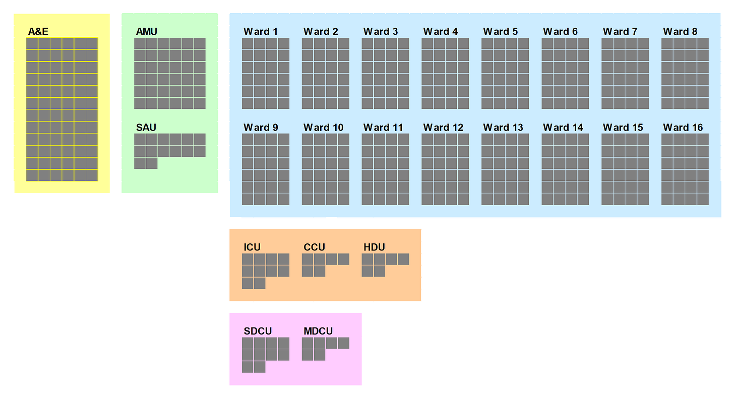
We need a map
Otherwise we won't know what to measure (and we'll keep banging into things)
It’s easy to take maps for granted these days.
But we didn’t always have maps. I’m not talking here about digital maps, about how – twenty years ago - we used to have paper maps as opposed to Google Maps. No, I’m talking about much longer ago.
I recently came across a comment in one of James Marriott's newsletters. He was quoting from a history textbook (JR Hale’s Renaissance Europe: 1480-1520), which made the point that in the early 16th Century, the vast majority of people had never seen a map and Geography wasn't taught in schools. The result was that…
"...without the habit of conceptualising space, a traveller going to war or work could not link his separate impressions to the nature of his route as a whole or extend them imaginatively to the unseen parts of the area through which he was passing; a man could not visualise the country to which he belonged; a landowner, unable to ‘see’ his properties as a whole was not concerned to concentrate his scattered holdings by sale or exchanges."
JR Hale was writing here about ‘travellers going to war or work’. But it made me think about hospital managers trying to improve patient flow. I wondered if managers actually have maps - either actual maps or just mental maps - when they think about patient flow. You’d think they ought to. After all, the word ‘flow’ implies movement from one place to another. In fact, it doesn’t just imply it; it means it. That’s exactly what patient flow is, it’s the movement of patients from one place to another. And that is surely a problem that’s tailor-made for a map to help solve. So: do NHS managers have a map?
My experience tells me that the operational - coalface - managers do. These managers know exactly where the Emergency Department is, and where the various wards and departments are, and how many beds there are in each ward, and which specialties the beds in those wards are allocated to. But the more strategic – senior - managers don’t. Or if they do, their maps are a bit vague, a bit sketchy, a bit inaccurate.
As well as distinguishing between actual maps and mental maps, we also need to distinguish between ‘reference maps’ and ‘thematic maps’. I think it’s important to have both.
The reference map (the one that’s geographically and architecturally correct) tells managers that Ward 4 (General Surgery) is opposite Ward 8 (Orthopaedics) and that both wards are on the first floor, just along from Radiology. The other map - the thematic map – is a more conceptual map that enables them to construct a mental image of patient flow (patients start their journeys in the Emergency Department, then move into an admission ward, then get transferred to a specialty ward, where they sometimes get moved from pillar to post, before being discharged).
In my experience, clinicians, operational managers and bed managers have internalized both of these maps.
Whereas data analysts (with a few honourable exceptions) have internalized neither of these maps. Their ‘domain knowledge’ is often so incomplete that they are ignorant of both the geographical relationships and the flow relationships. And yet analysts need both the reference map and the thematic map if they are to do their jobs properly. Firstly, this cartographic knowledge can help them establish credibility with clinicians. If analysts know the names of the wards and how many beds each ward has got, and if they can also demonstrate a knowledge of typical pathways through these wards, it usually helps to counteract the default assumption that clinicians will make about analysts that they just work in remote ivory towers dealing with high-level totals, averages and percentages.
Secondly, when it comes to describing and measuring patient flow, analysts can’t get the data into meaningful chunks unless they understand the interplay between patients, wards and specialties. Which means having - and being able to make sense of - both the reference map and the thematic map.
There were a couple of newsletters recently that - for me - highlighted the dangers of not having a map. Both of them were - as it happens - assessments of Sir Keir Starmer’s first year as Prime Minister. One was by Jonn Elledge, who - rather brutally - described Starmer as “a man who moves through politics like a Roomba moves through your living room: without a plan, capable of mapping the territory only when he bangs into things and has to reverse.”
The other was by Ian Leslie, who focused on Starmer’s manoeuvrings on transgenderism: “He edged hesitantly and slowly towards a sensible position, sometimes moving sideways or backwards before going forward again, and always in reaction to signals from his environment rather than from his own mind - he never actually appeared to have thought it through himself or to have a strong internal feeling about it.”
Like the Prime Minister, we need a map. It’s no good finding out where we are just by banging into things. And if we are to have a clear sense of what the whole system looks like, and how we can improve that whole system, we need a map before we can make a plan.


